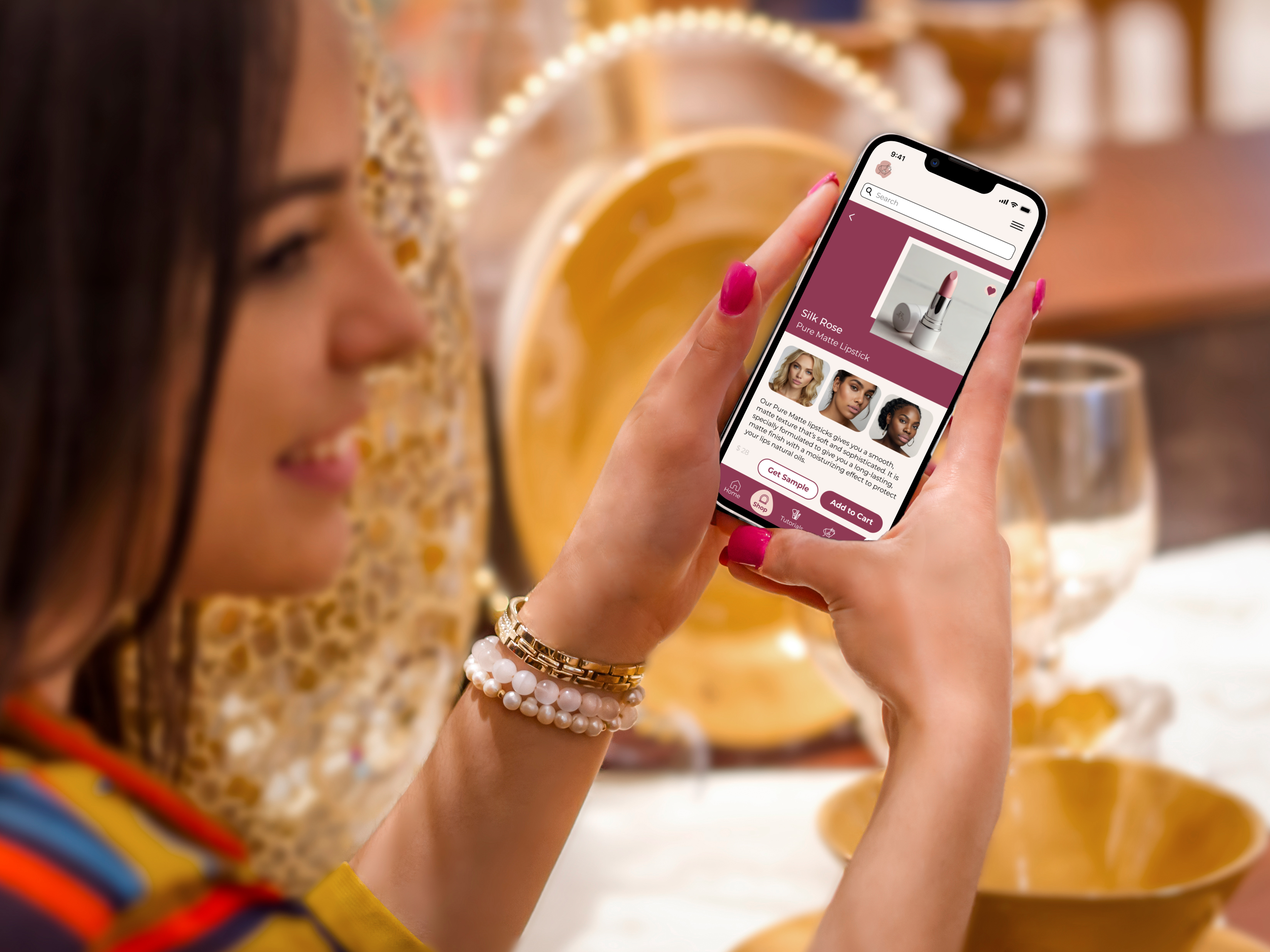
← All Work

Beauty & Makeup App  ·  UX/UI + Brand Design  ·  2024

Uniquely
Yours

Personalized beauty guidance built for your skin, not someone else's.

Role

UX/UI Designer
Brand Designer

Timeline

Student Project · 2024

Tools

Figma · Photoshop

Deliverables

UX Research · UI Design
Brand Identity · Logo

The Problem

You can watch a thousand tutorials. None of them are filmed on your skin.

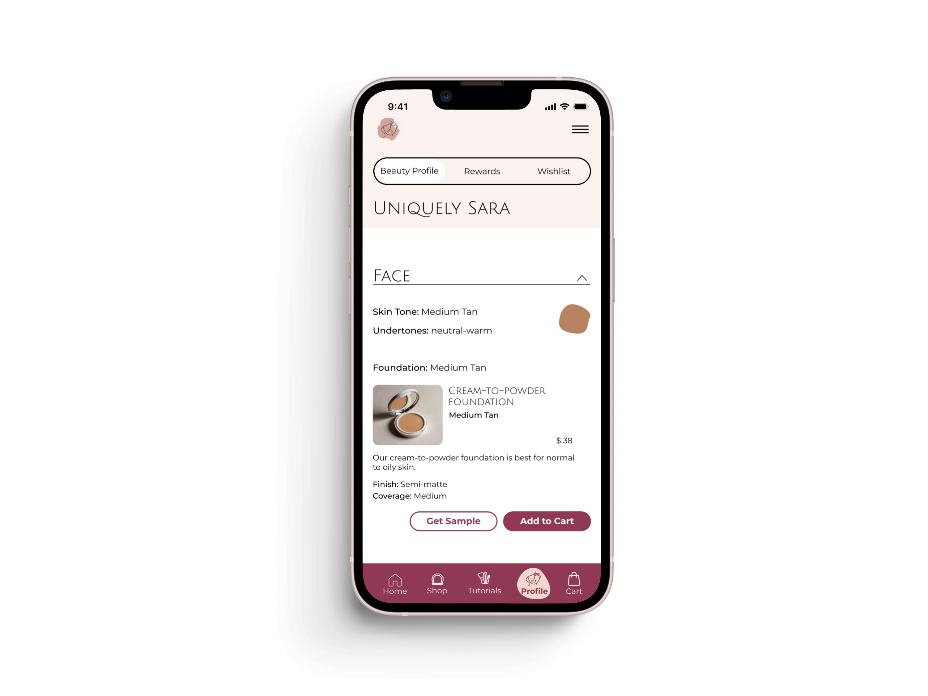
I was fortunate to grow up with a cousin who trained as an esthetician. She looked at my face specifically and told me what would work. That kind of guidance has nothing to do with what you can find online: it is personal. Why does Diva Red look stunning on her but make you look tired? Skin shade and undertone. That is what no tutorial, no magazine, and no makeup app had figured out how to replace.

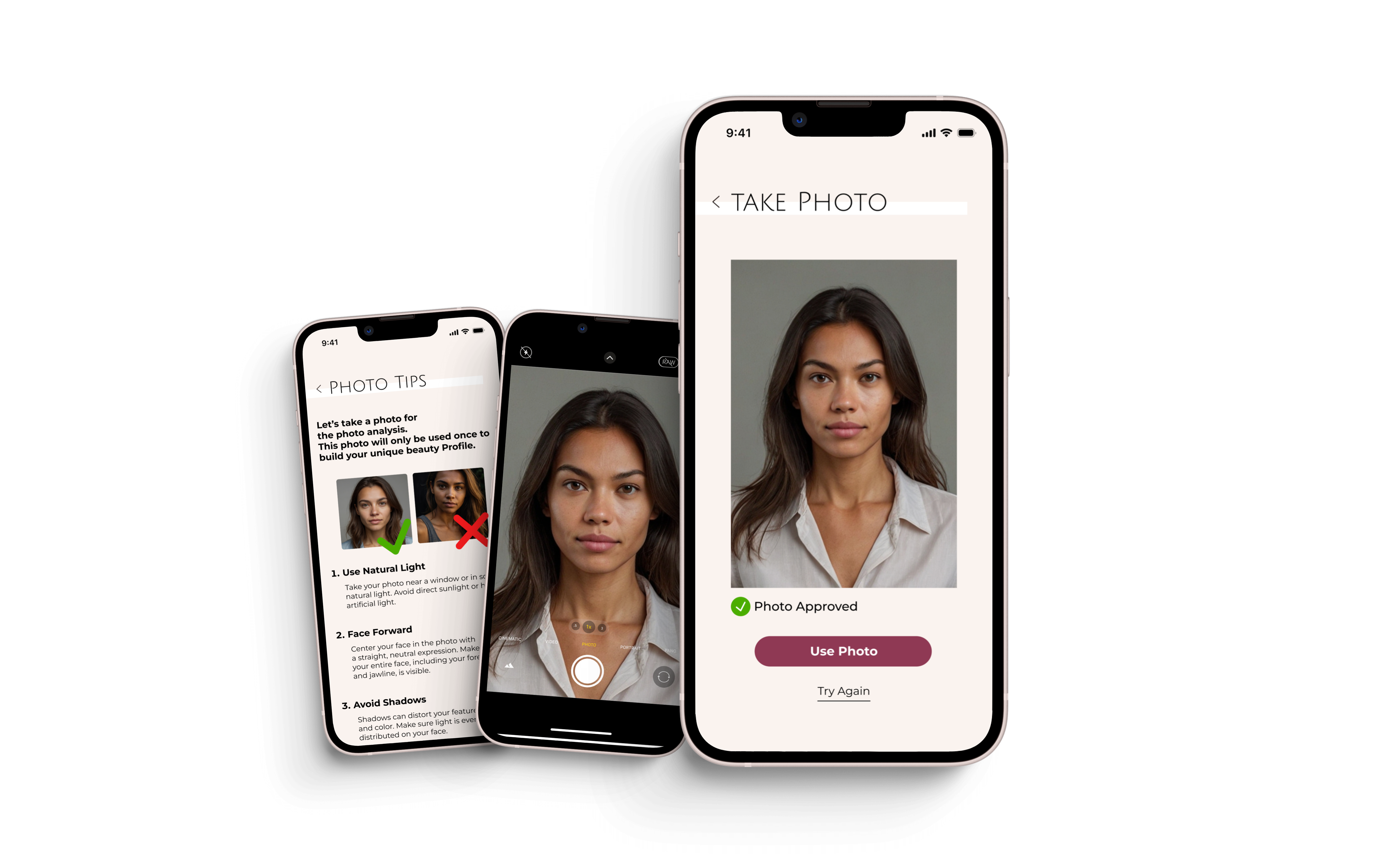
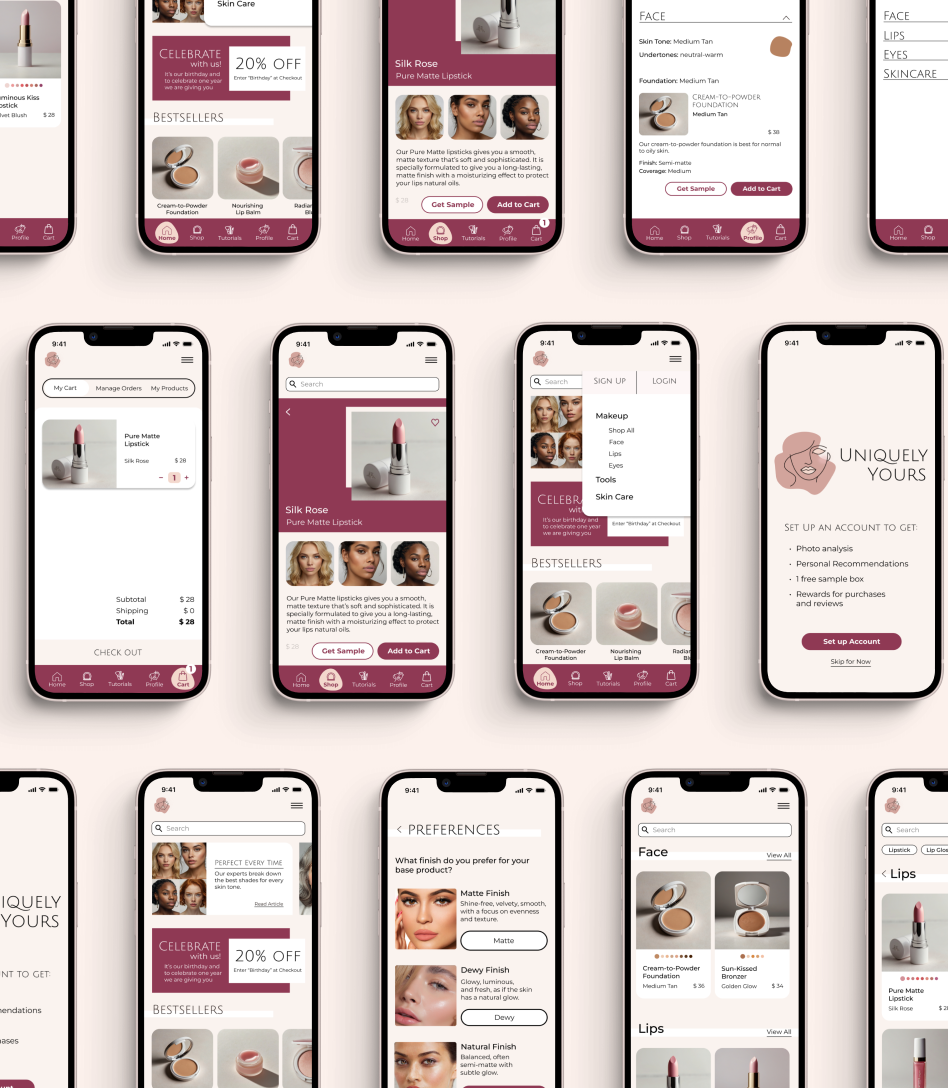
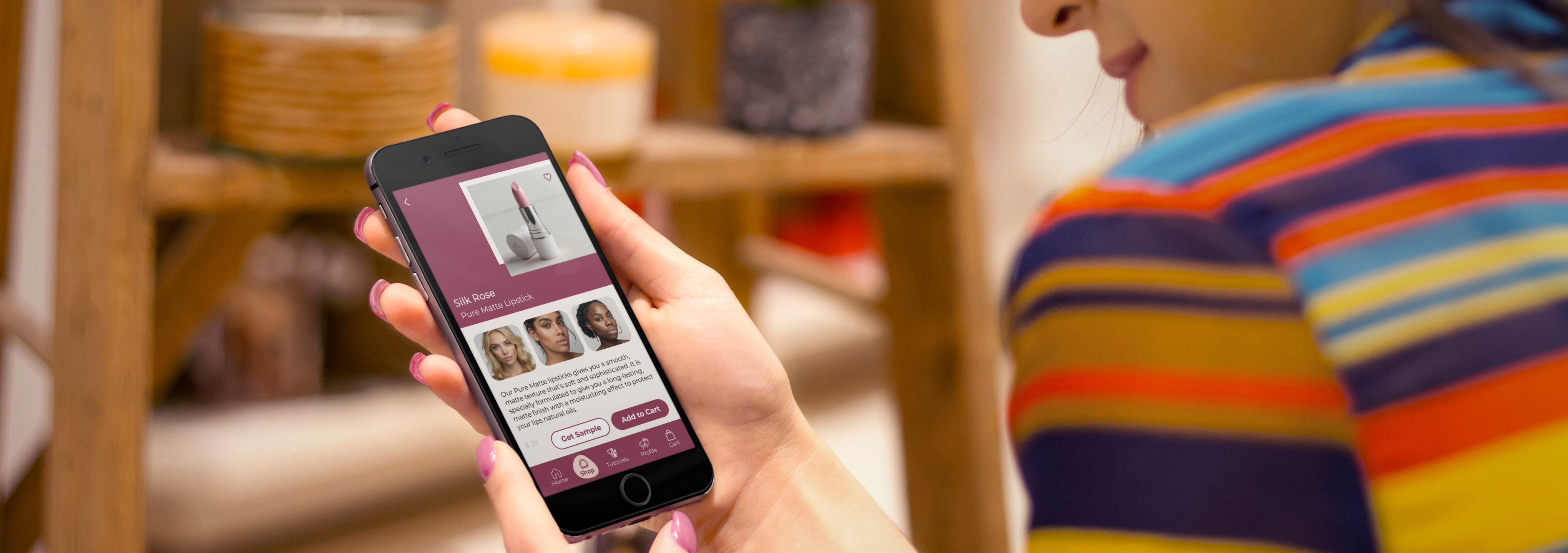
Every existing makeup app attempts to fill that gap, but stumbles at the first step: scroll through a grid of photos featuring people of varied ethnicities and pick the one whose skin looks most like yours. Then select your undertone: warm, cool, or neutral. The problem is that most people can't accurately compare their skin to a photo of a stranger, and even fewer know what their undertone actually is. They guess, the guess is wrong, and every recommendation built on top of it is wrong too.

"I've bought three different foundations this year. I always pick the wrong shade. I can never tell if I'm warm or cool."

Uniquely Yours app on phone

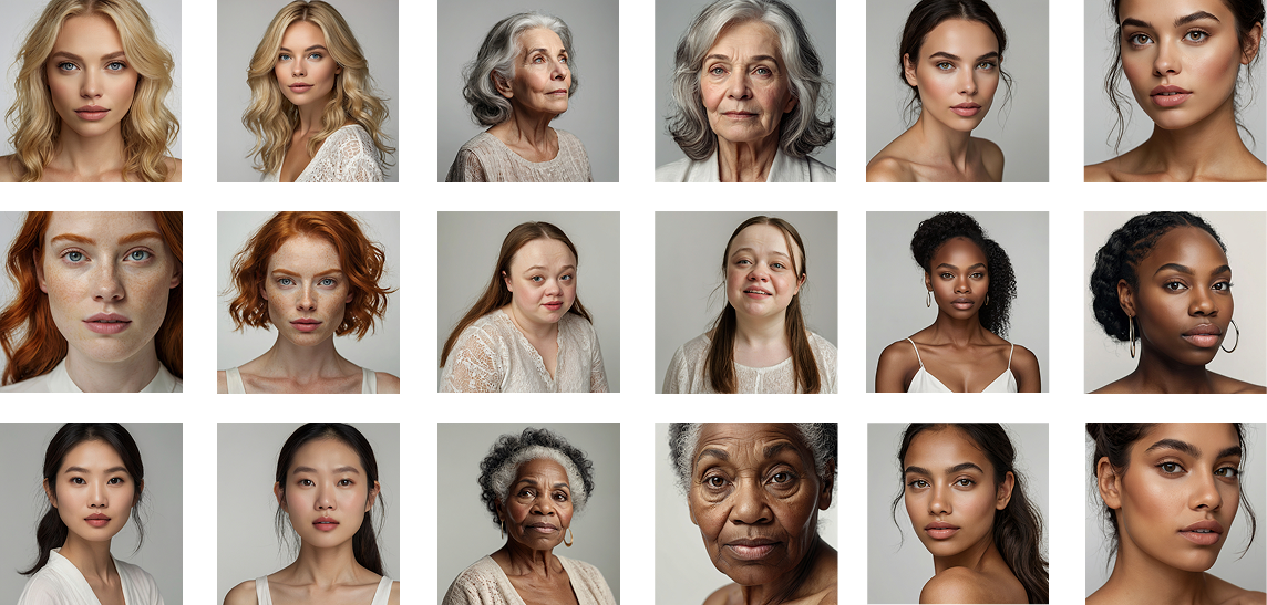
The real gap: a photo grid can't represent the full spectrum of human skin tone.

Even a thoughtfully curated selection leaves out millions of variations in between. And comparing your skin to someone else's photo through a screen, under different lighting, is an unreliable method at best. Uniquely Yours removes the comparison entirely. The AI reads your skin directly, so the starting point is accurate.

The guesswork is where it breaks down.

I interviewed 3 users via Zoom and collected feedback from 4 additional users who tested the prototype independently. Participants ranged from a former makeup artist to someone navigating color-matching challenges for the first time. Three themes surfaced consistently.

Woman using Uniquely Yours app to shop for lipstick

"The thing with blushes and lipsticks — based on the chemistry of your skin they can change color. So that is something that should be tested. It's a trial and error."

Tiegan, 25–35 · Former makeup artist

"I don't think I have asked for help at the store in like 15 years."

Diana, 25–35 · Teacher, goes in-store to swatch because online tools don't work

"I quite like how you have three different models each with the same lipstick color, with different skin tones. I think that's really helpful."

Tiegan, on seeing products shown across skin tones

Joy, 60–65 · Retired, listed challenge: "Color-matching for skin tone."

Joy's self-reported challenge was the exact problem Uniquely Yours was built to solve. She relied on an influencer who specializes in makeup for older consumers, not because she preferred that, but because color-matching online felt impossible without that kind of guidance.

Design Approach

Don't ask. Scan.

The solution wasn't a better question: it was removing the question entirely. Uniquely Yours uses the device camera and an AI model to analyze a photo of the user's skin and determine their tone and undertone directly. No guessing. No Googling. No picking a swatch that's close enough.

To make the scan accurate, the app coaches users through how to take a usable photo before they take it: natural lighting, no makeup, face centered. The guidance is embedded in the UI so it feels like part of the experience, not a technical prerequisite.

01

Photo Guidance

The app walks users through how to take a usable photo: natural lighting, no makeup, face centered. Clear, friendly, and built into the flow.

02

AI Skin Scan

The AI model analyzes the photo and determines the user's skin tone and undertone, accurately, without asking them to already know the answer.

03

Profile Built

Tone and undertone confirmed. The app presents results clearly so users finally learn something true about their skin, not a guess.

04

Matched Products

Every product recommendation is drawn directly from the scan results, with an explanation of exactly why each one works for this specific skin profile.

Uniquely Yours skin scan screens

Addressing privacy before users think to ask.

The photo tips screen includes a direct message: "This photo will only be used once to build your unique beauty profile." Asking someone to submit a photo of their bare face is a significant trust ask. Proactively addressing data use (before the camera opens) was a deliberate design decision, not an afterthought.

Every recommendation explains itself.

Once the scan is complete, every product recommendation includes a "Why this works for you" callout, connecting the specific formula, shade depth, or finish to the user's actual scan results. Users don't just get a recommendation; they understand it. The goal was confidence, not just a shopping cart.

Uniquely Yours scan results screen

User Flow

From scan to purchase.

Uniquely Yours user flow diagram

Final Design

A shopping experience that feels like it was made for you.

Uniquely Yours full app screen spread

A full brand system, not just a logo.

The Uniquely Yours identity was designed alongside the app as a complete system: logo, color palette, typography, iconography, photography direction, and tone of voice. Every element reflects the same core promise: beauty that works for you, specifically.

Color Palette

Typography

Headlines: Julius Sans One  ·  Body: Montserrat

Three logo variations (on light, neutral, and dark/plum backgrounds) were created to ensure the mark works across every context the brand appears in.

Uniquely Yours logo and color palette
Woman using the Uniquely Yours app while shopping

Diversity as a design decision, not a checkbox.

The photography direction: minimalistic close-ups on neutral studio backdrops, chosen to keep the focus on skin. The model selection spans a wide range of ages, ethnicities, and skin tones deliberately: the brand's promise of personalized recommendations for everyone needs to be visible before a user even opens the app.

Product pages show each item worn by three models with different skin tones. This was the feature user Tiegan specifically called out as "really helpful" during testing, and it directly addresses the problem of products looking different on different skin chemistry.

Diverse model photography direction

Testing & Iteration

What testing revealed, and what I changed.

After testing with 3 users via Zoom and 4 additional independent testers, clear patterns emerged. None of the issues were catastrophic. The core flow worked, but the details mattered. I documented every friction point and addressed each one directly.

01

CTA Language

Problem: "Start my Beauty Journey" confused Joy; she didn't realize it would set up an account.

Solution: Changed to "Set up Account." Clear, direct, no surprises.

02

Color Slider Visibility

Problem: Both Diana and Tiegan missed the color slider entirely and assumed products only came in one shade.

Solution: Moved sliders directly under the product photo, above the fold, where the eye naturally lands.

03

Preference Visuals

Problem: "Matte," "Dewy," and "Natural" mean different things to different people, especially those newer to makeup terminology.

Solution: Added close-up facial photos to each finish option so users could see, not just read.

04

Navigation Structure

Problem: The home page lived inside "Shop"; once users browsed deeper, they couldn't find their way back intuitively.

Solution: Separated Home and Shop into distinct sections. Added a Home icon to the tab bar. Moved wishlist into the Profile section for a cleaner hierarchy.

Uniquely Yours iconography refinements

Two more refinements worth noting

Active state icons: Bold text alone wasn't distinct enough to show where a user was in the app. Added a color-filled background to selected tab bar icons, a small change that resolved a navigation clarity issue immediately.

Ingredient transparency: For users like Tiegan, who prioritize vegan and cruelty-free products, the product page was extended to scroll to full ingredient listings, so the information that drives their purchasing decisions is always findable.

Uniquely Yours lifestyle

Reflection

The bigger picture.

The deeper goal was always to be the knowledgeable cousin, the person who looks at your specific face and tells you exactly what will work. Not a generic bestseller list. Not a rule for "your skin type." Actual, personalized guidance. That's what makeup knowledge has always been when it's passed down well. Uniquely Yours makes it available to everyone.

If I continued this project, I'd explore a "look builder": choose a finished look (natural day, bold evening), and the app surfaces every product your scan profile needs to achieve it. I'd also extend the AI to learn from what you loved and what fell flat, so recommendations improve with every purchase.

One gap I would address in future iterations is audience inclusivity. The initial design focused on women, but the makeup market extends well beyond that. Male makeup artists, influencers, and everyday users represent a meaningful segment that deserves the same level of personalized guidance. Designing with that broader audience in mind from the start would make Uniquely Yours a more complete and honest product.

The single most impactful decision

Removing the undertone question entirely, letting AI read it from a photo instead of asking users to guess, was the foundation everything else rested on. When the profile is accurate, every recommendation downstream is accurate. That's the moment the app earns real trust.

Next Project

Ruff Routes