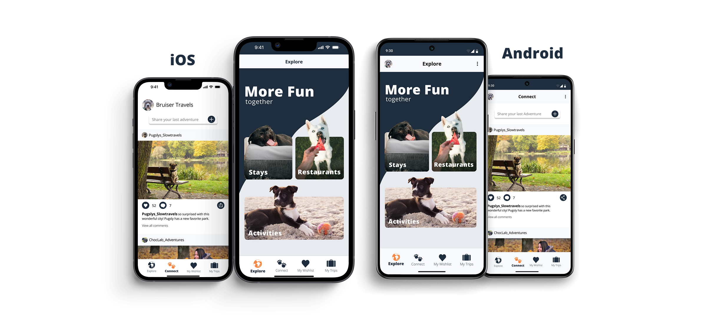
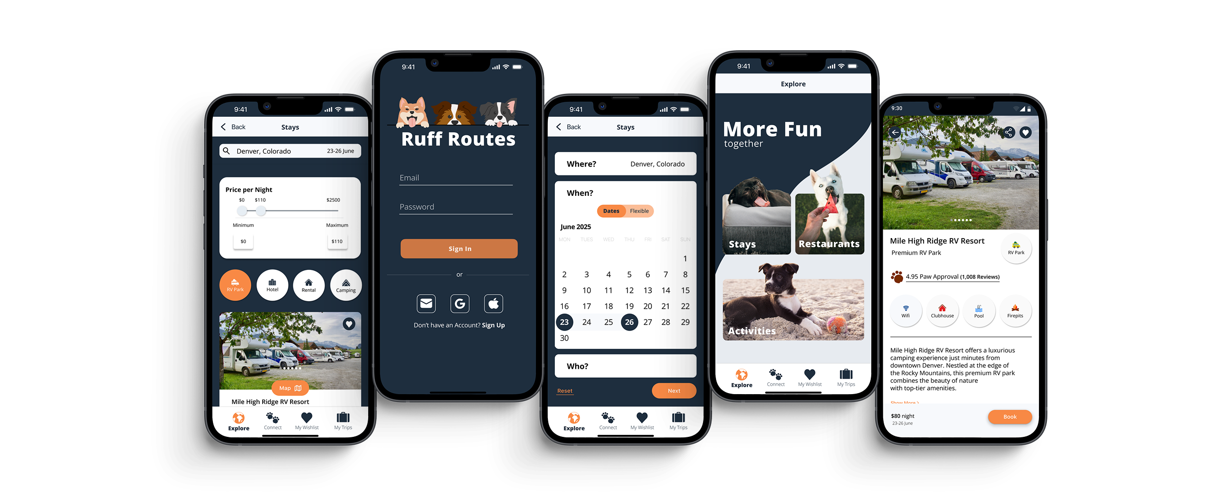
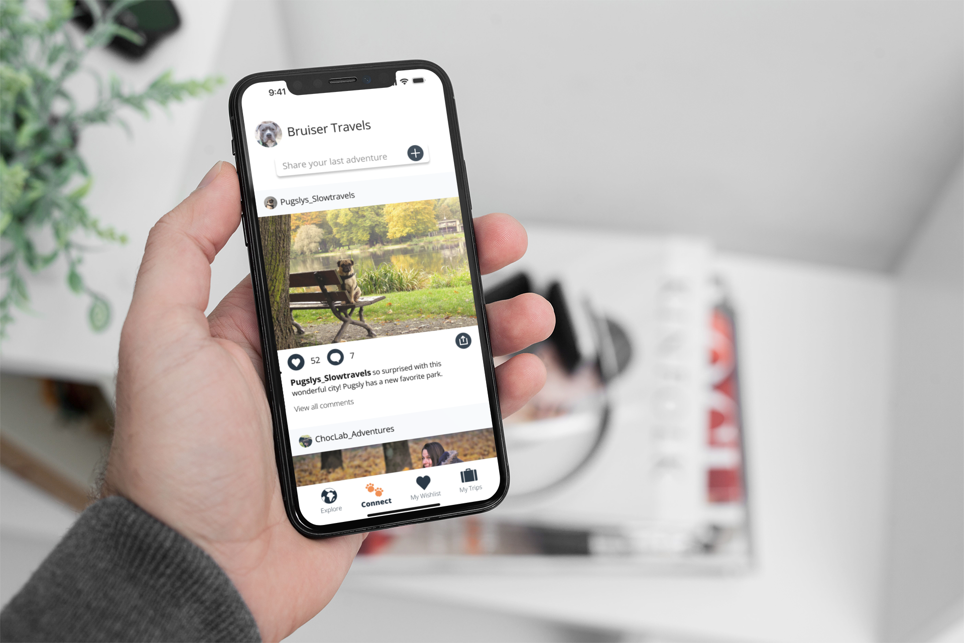
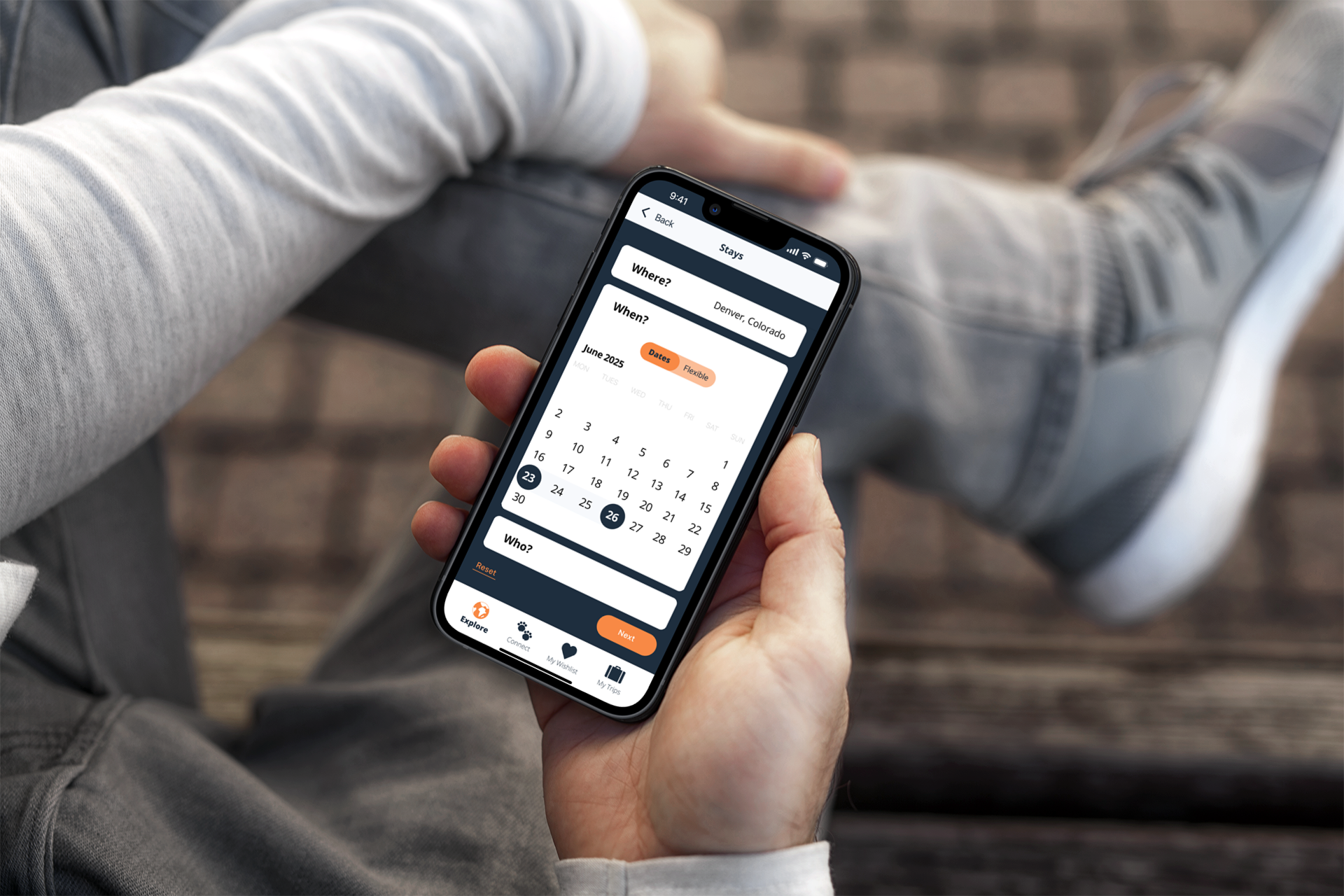
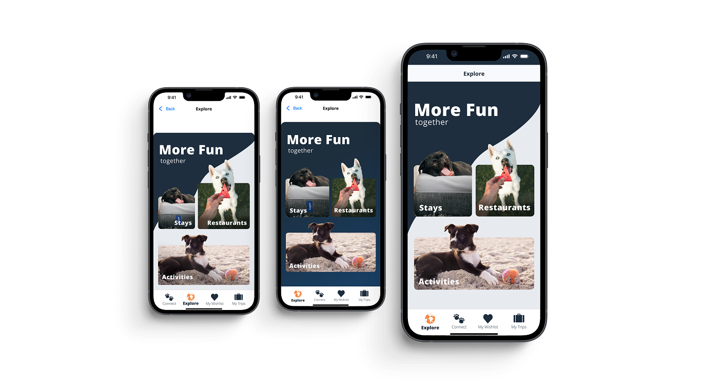
← All Work

UX/UI Case Study  ·  Native Apps  ·  2024

Ruff
Routes

Every trip is better with your best friend.

Role

UX/UI Designer
Brand Designer

Timeline

Student Project · 2024

Tools

Figma

Deliverables

UX Research · UI Design
Brand Identity · Logo

The Objective

Build once for iOS. Build again for Android. Make them feel like one.

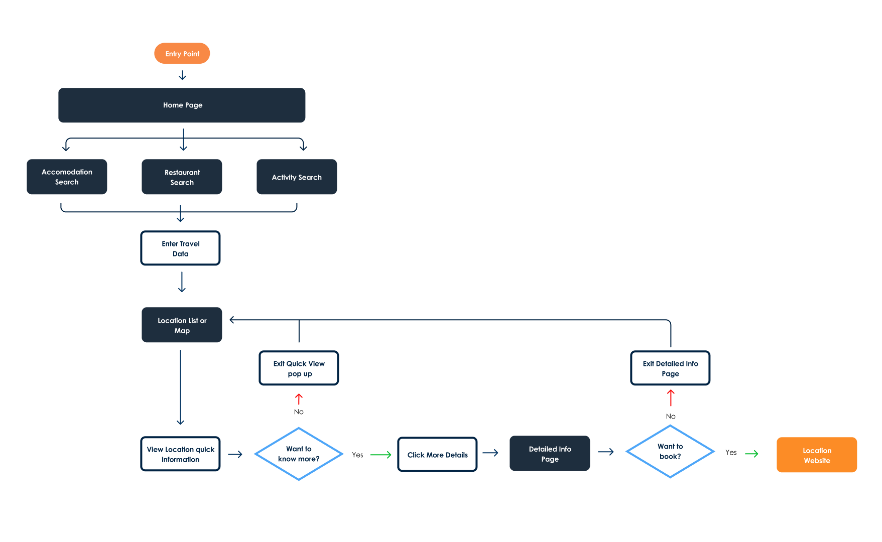
The goal was to design both the iOS and Android versions of a mobile app that solves a specific user problem, maintaining a consistent user experience across platforms while respecting each system's design guidelines.

That meant understanding where the two platforms align and where they diverge: navigation patterns, typography hierarchies, icon conventions, and making deliberate decisions at each point rather than defaulting to one system's rules for both.

The constraint that sharpened the design.

Designing for two platforms simultaneously forces clarity. Every component had to be intentional enough to translate across systems without losing the brand. That discipline made the final product stronger on both.

Ruff Routes iOS and Android side-by-side comparison

The Problem

Traveling with a dog means hours of research that shouldn't be necessary.

My mom and my best friend both travel constantly with their dogs. Watching how much planning goes into something as simple as a road trip stop, checking if a restaurant has a patio, whether that patio allows pets, whether a particular dog breed is welcome, made it obvious that no one had solved this well.

On a road trip with my parents and their dogs, I saw it firsthand. We spent time cross-referencing Google Maps, Yelp, and general web searches just to find somewhere we could stop for food. We ended up defaulting to "find a brewery with a patio" because that was the most reliable shortcut. That's not a solution. That's a workaround.

There was also no place for dog-owning travelers to find each other. The best recommendations for pet-friendly spots live in breed-specific Facebook groups, Reddit threads, and word of mouth. Ruff Routes brings the search and the community into one app.

"We just looked for breweries with patios. It shouldn't be that hard to find somewhere dog-friendly."

The gap: no single source of truth.

Pet owners are scattered across Maps, Yelp, Reddit, and breed-specific Facebook groups just to plan a trip. Ruff Routes brings it together in one place, built around the traveller, not the destination.

Design Decisions

Built for quick decisions on the road.

The core use case: someone in a moving car, needing a stop in the next 20 minutes. That shaped every design decision. The interface needed to surface the right information fast, with as little input as possible.

List or Map, Your Choice

The search interface gives users a toggle between list view and map view. Some people scan spatially; others prefer to read through options. Both are valid ways to find a stop, so both are supported.

Route-Based Search

Search along your route, not just around a pin. A road trip isn't about where you are. It's about where you're going. Ruff Routes finds stops along the way, and when you're looking at a hotel, activity and restaurant toggles let you layer in what's nearby so you can see the full picture before you commit.

Honest Pet Policies

Indoor vs outdoor, leash required, size restrictions, breed policies, surfaced clearly on every venue. No surprises when you arrive with a 60-pound dog.

Save Your Stops

Bookmark venues to a trip itinerary. Plan ahead or save as you go, so every future trip with your dog starts from a better place than a blank search.

Connect with Fellow Travelers

The Connect tab is a social feed where dog owners share photos, post trip updates, and discover spots through people who travel the same way they do. The best recommendations come from people who've already been there with their dog.

One search type. Three searches solved.

The app includes three search categories: hotels, restaurants, and activities. Rather than wireframing all three simultaneously, I designed one search flow end to end first. The three categories share enough structural overlap that catching usability and visual issues in one meant the fixes would carry forward to all three. Designing in sequence rather than in parallel saved time, reduced repeated mistakes, and produced cleaner screens across the board.

User Flow

From open app to found stop, in as few taps as possible.

The core flow needed to get a user from opening the app to a confirmed pet-friendly stop, with no dead ends and no screens that required reading. Route-based search was the backbone: find stops along your route, not just near your current pin.

Ruff Routes user flow diagram

Final Design

Clear, confident, and always one tap away.

Ruff Routes car location search screen
Ruff Routes app across five screens
Man using Ruff Routes app on iPhone
Ruff Routes calendar and itinerary screen

Brand Design

A brand that feels like an adventure.

The Ruff Routes identity needed to capture the feeling of a road trip with your dog: free, a little rugged, and genuinely joyful. The logo leans into that energy: sturdy enough to feel trustworthy, warm enough to feel playful.

The deep navy palette grounds the brand in reliability. This is an app you open when you actually need it, while leaving room for the warmth of the product category. Dogs make trips better. The brand should feel that way.

Ruff Routes logo
Ruff Routes billboard mockup

Icons designed from scratch.

Every icon in the app was designed independently. Rather than relying on size or shape changes to communicate an active state, color and bold text labels do that work — keeping the interface legible at a glance without adding visual noise.

Testing & Iteration

Two layouts. 19 people. A result that surprised me.

The Explore screen is the first decision a user makes: stays, restaurants, or activities. I designed two layout approaches and put them in front of 19 people to see which one they responded to before committing to a direction for all three search flows.

Design A used asymmetric widget sizes with a two-tone diagonal background and images that bled intentionally past the widget borders. Design B used symmetric, equal-sized widgets against a gradient navy background. The results were closer than expected: 52% chose Design A and 47% chose Design B. Of those who preferred B, 22% said they liked the symmetry of B but preferred the background from A.

The results were close enough that the final design pulled from both. I kept the two-tone background from A, adjusted the widget sizes toward the symmetry of B, and kept the images overflowing the widget borders as a deliberate design choice to create visual interest.

When the data is a tie, design decides.

A 52/47 split isn't a clear winner. It's feedback. 22% of voters liked elements from both designs, which told me the right answer wasn't either option as-is. The final Explore screen is a synthesis of what worked in each.

Ruff Routes A/B test: Design A vs Design B Explore screen layouts

Reflection

What I'd carry into the next version.

Designing for two platforms at once pushed me to think more systematically than I had on previous projects. Catching and resolving a design decision in one flow meant fixing it across hundreds of screens rather than thousands. By the time I moved to the next flow, the improved decisions were already built in from the start, so errors and inconsistencies never had the chance to multiply.

If I were to take this further, I'd expand the Connect feature into a more structured community layer, test the route-based search with real GPS data, and explore how to handle breed-specific policy filtering without overwhelming the UI.

"The constraint of two platforms forced every decision to be deliberate. That discipline showed in the final product."

On The Road

The world Ruff Routes is built for.

Dog owner on the beach with their dogs Travelling with a dog Dog on a road trip

Next Project

Cork & Fork