Wine & Recipe App · UX/UI Design · 2024
Because "white wine with fish" isn't an answer.
The Problem
Having worked as a server at a fine dining steakhouse, I understood firsthand how overwhelming wine lists felt for most guests.
The guidance most people have heard is: white wine with fish, red wine with steak. It sounds helpful, but those rules are generic and don't take the nuance of flavor into account. A German Riesling and a California Chardonnay may both be white wines, but they are not interchangeable. The herbs, the sauce, the preparation method: all of it matters. And no recipe app was asking those questions, so I did.
The other gap was hosting anxiety. People don't just need a wine recommendation. They need to feel confident planning a full meal, scaling for a group, and knowing what they can prepare in advance. A wine app alone doesn't solve that.
"When I am hosting a dinner I need to make sure the wines pair well with the meal, so that our dining experience is good."
The insight: start with the recipe, not the category.
Wine pairing is about all the ingredients: the dominant flavors, the cooking method, the sauce, the sides. Cork & Fork starts from the dish you're building and suggests wines that actually fit.
The secondary insight: explain the why.
Users didn't just want a name. They wanted to understand why a wine works, so they could make confident choices at restaurants and trust themselves over time.
Who We Designed For
Research surfaced three distinct users with different levels of cooking and wine experience, but a shared need: they wanted the experience of cooking and entertaining to feel joyful rather than stressful.
Persona 01
Megan: The Enthusiastic Host
Megan loves hosting dinner parties and creating memorable experiences. She's a skilled cook, but her wine knowledge is limited to the basics. She's open to learning, as long as the information is easy to find and doesn't require fluency she doesn't have yet.
Persona 02
Michael: The Introverted Beginner
Michael recently started cooking and occasionally invites a couple of friends for a quiet dinner. He wants to impress without overwhelming himself. He's learning as he goes and needs an app that builds his skills rather than assuming he already has them.
Persona 03
Lisa: The Traditional Cook
Lisa often cooks for friends and draws inspiration from cookbooks and cooking shows. She's familiar with classic pairings but finds the planning and preparation stressful. She's actively interested in exploring non-standard pairings. She just needs a trustworthy guide.
User Research
Three interviews revealed a consistent pattern: food comes first, wine is an afterthought. Most participants knew the basics, white with fish, red with steak, and stopped there. They weren't intimidated so much as indifferent. The real opportunity was showing them what they were missing without making them feel behind.
"Not confident at all ... I know red wine with steak, white wine with fish ... that's pretty much it."
Matthias, on his wine knowledge
"I don't put much effort into really thinking about it. It's more like, oh we are having shrimp so I guess I will get some sort of white and I like Sauvignon Blanc, so I'm gonna get that."
Diana, on pairing at home
"If there was some sort of menu with the wine pairing that said hey start with this main and here's some options for sides and here are some wines you might consider. Just tell me what to do."
Diana, on what would actually help
Rather than designing from assumptions, the research mapped real user needs as Jobs to be Done: specific statements about what users were trying to accomplish and why. These became the foundation for every feature decision.
"Old cookbooks for entertaining would tell you when to do things and what to prepare in advance. Washing your linens a week before, making sure you have enough serving dishes, what can be made ahead and reheated."
"Obviously I want to give our guests a good experience and you'll definitely serve wine."
Design Approach
Most wine apps ask "what are you eating?" and return a category. Cork & Fork takes the opposite approach: you build your dish and your menu first, selecting your entree, sides, and courses, and wine suggestions surface naturally once the meal is defined. The recommendation comes with a plain-language explanation of why it works, so you learn by doing rather than studying.
User Flow — Build a Menu
From twelve Jobs to be Done identified in research, four were prioritized for the MVP, the ones most unique to Cork & Fork's value proposition: curating a coursed meal with wine, generating a smart shopping list, finding in-store substitutions, and setting preparation timelines so nothing comes out cold.
The explanation teaches, not lectures.
Each wine suggestion includes a short note connecting the varietal's character to your specific ingredients. Not "Pinot Noir pairs with salmon." Instead, why this wine works with your sauce, your sides, your method. That's the difference between a rule and an understanding.
Key Features
Smart Wine Pairings
Create Menu
Photo-First Recipe Library
Hosting Timeline & Reminders
Auto Shopping List
Final Design
The visual direction was inspired by photo-first minimalist cookbooks, the kind where the image does all the talking and the design gets out of the way. Clean white backgrounds, generous white space, and editorial food photography that makes every recipe feel considered rather than cluttered. Wine type labels use distinct color blocks: tan for whites, pink for rosé, and deep burgundy for reds, so users can distinguish at a glance without having to read.
Testing & Iteration
Usability testing was conducted over two rounds in July 2024 with three participants: Constance (teacher), Anna (designer), and Matthias (tax consultant), all 25–35, Hamburg-based. Sessions ran 25–35 minutes via Zoom. Each tester completed three tasks: finding a saved recipe, building a dinner menu with wine pairing, and generating a shopping list.
After Round 1, targeted changes were made to language and visual hierarchy, then tested again. The key finding: changing the language alone increased understanding. The flow that had required explanation became intuitive.
"That's really important. They can tell me what I did wrong. You learn from other people's mistakes."
Constance on recipe reviews
"It helps a person like me organize. Someone who doesn't cook very well."
Anna on the menu builder layout
"From here it is very clear to me, I don't have any comments."
Anna on the menu page after iteration
Round 1 · Issue 01 · Error Rating 4/5
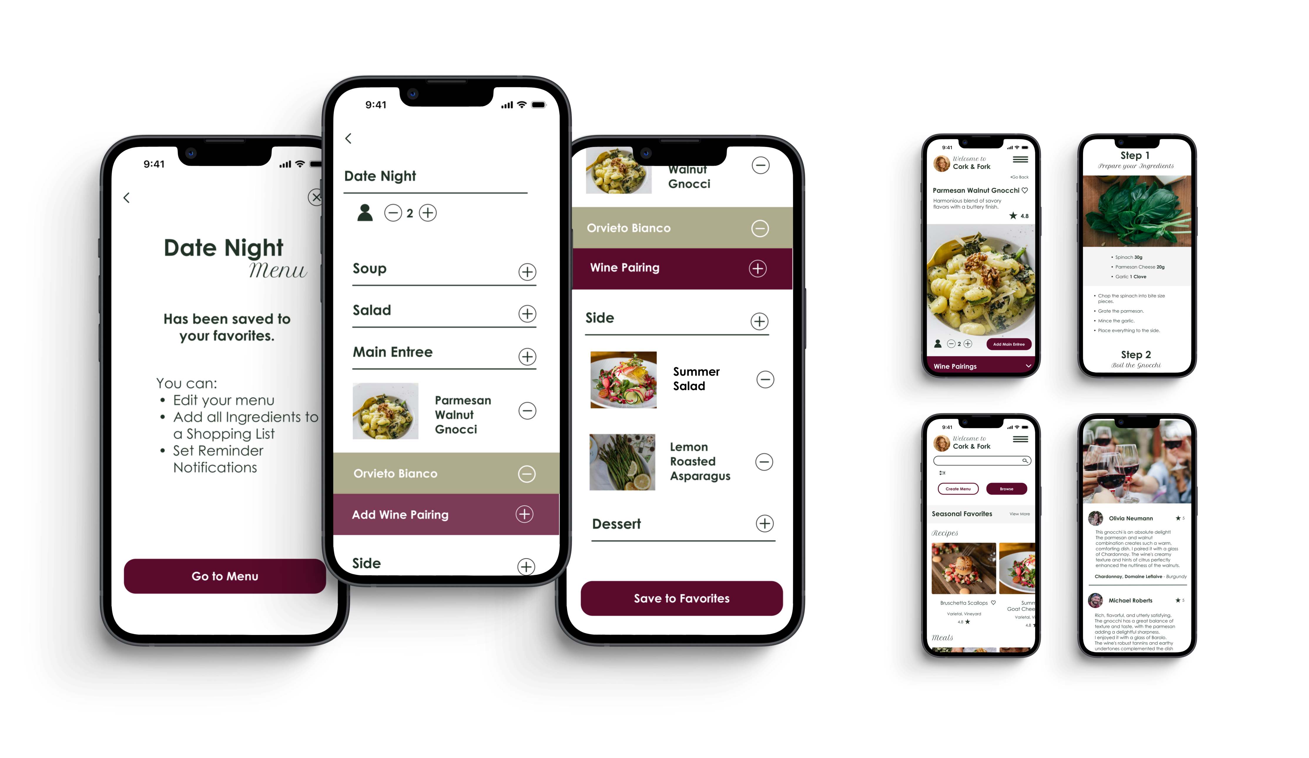
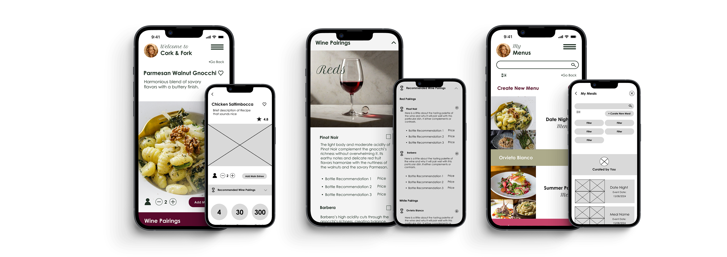
Calls to action were confusing. Users didn't know what "Curate Meal" meant.
Both testers were confused by the word "curate" and didn't understand that naming a meal meant creating a menu. Constance: "Curate and Meal not clear."
Fix: Renamed "Curate Meal" → "Create Menu" and "Add Sides" → "Add to Menu" throughout. Language was made consistent and action-first.
Round 1 · Issue 02 · Error Rating 4/5
Users didn't notice the difference between wine section types. Red vs. white wasn't clear at a glance.
Constance said about the wine section: "I'm not sure if this one is white or not." The section headers weren't distinct enough to register the category difference.
Fix: Added larger spacing between wine sections, shorter headings with enlarged text, and distinct color blocks per wine type: tan for whites, pink for rosé, and deep burgundy for reds.
Round 1 · Issue 03 · Error Rating 3/5
The "Add Wine Pairing" option wasn't visible. Users missed the wine icon under the entree.
Anna only noticed the wine pairing section after adding her sides and the icon changed state. The small wine icon with a plus sign was easy to overlook.
Fix: Added a prominent color block with the full text "Add Wine Pairing", making the action visible without requiring users to find an icon.
Round 2 · Issue 04 · Error Rating 4/5
Users tried clicking text labels to navigate into sections, not the plus icons.
Matthias clicked directly on the "Main Entree" text and couldn't advance to the next screen. The tap target was only the icon, not the full row.
Fix: Expanded clickable areas to include both the text label and the icon, making the entire row interactive.
Round 2 · Issue 05 · Error Rating 2/5
Circular stat icons (ingredient count, time, calories) were confusing because the labels were below the scroll.
The circles with numbers on the recipe page didn't reveal their meaning until the user scrolled down to see the labels underneath.
Fix: Adjusted vertical spacing so labels appeared directly beneath each number without requiring a scroll.
Shopping List · Consistent Issue
"Import from Favorites" language was misread. Users expected it to import a list they had already made.
Constance interpreted "Import from Favorites" as bringing in a shopping list she'd already created elsewhere, not pulling ingredients from a saved recipe into a new list. Matthias was similarly confused by the "Create New" button.
Fix: Reworded the call to action to be explicit: "Add Ingredients from Menu," leaving no ambiguity about what would be imported.
Reflection
The most important thing I learned from this project wasn't about the app. It was about process. I tried to design too many flows in the first iteration, and it overcomplicated the work. Every adjustment took longer because there was more to untangle. Starting smaller would have let me catch issues sooner and build from real insights rather than assumptions.
Testing confirmed this. The testers who struggled didn't struggle because the interface was confusing. They struggled because a single word ("curate") broke the mental model. That was a language problem, not a design problem, and it only became visible once people were actually using it. Better MVP focus means faster, more honest feedback.
For a next iteration, the priority would be collaborative features: shared menus for group dinners, task assignment for who's bringing what, and educational wine notes to help users understand why a pairing works, not just what to pick.
What worked
The photo-first layout, drawn from minimalist cookbook design, kept the visual hierarchy clean and let food photography carry the emotional weight. The color-coded wine label system gave users immediate cues without reading. And after the Round 1 language fixes, Matthias moved through the menu builder with no confusion at all. One word changed the whole experience.
What I'd push further
A "pantry mode" (what wine and recipe work with what you already have tonight) would extend Cork & Fork's usefulness to everyday meals, not just planned occasions. Over time, the app could learn which pairings a user loved and get smarter about their specific palate.
Photography: Brooke Lark, Jay Wennington, Kelsey Knight, Jonathan Borba via Unsplash & Pexels