A retro-rooted brand identity for a disposable camera app: logo, illustration, two identity directions, and a full icon system.
Role
Brand Strategy · Illustration · Icon Design
Deliverables
Logo · Illustration · Secondary Mark · Icon System
Tools
Figma · Illustrator
Collaboration
Ana Carolina Petri
Year
2025
The Brief
A film app that needed a brand to match the feeling.
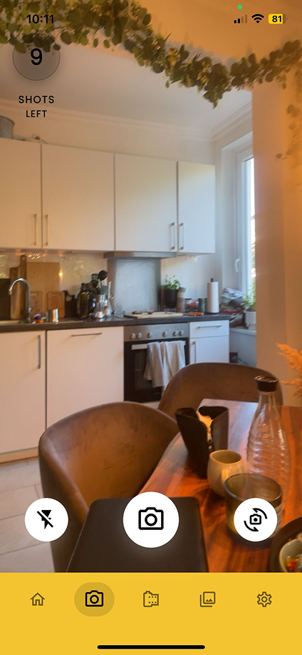
Filmorolla is a disposable camera app. You take ten shots, and the photos are revealed after a delay, just like real film. The concept leans into the nostalgia and anticipation that made disposable cameras feel special in the first place.
The clients had an app but no visual identity. They reached out for help building a brand that matched the emotional experience of the product, something that felt analog, warm, and a little nostalgic, without feeling dated.
The core feeling
The app is about delayed gratification, the anticipation of not knowing how your shots turned out. The brand needed to carry that same warmth, that same sense of something worth waiting for.
Style Direction & Color
Film, not cameras. Warm, not kitschy.
The starting point was an obvious one: cameras. But cameras as a logo subject are overdone: every photography brand, app icon, and retro filter uses a camera. We pushed past it. Film itself was more interesting, more specific to what the app actually does, and less expected.
For the visual direction, the 70s felt right, not the kitsch version, but the warmth of it. Rich earthy tones, genuine texture, color used with intention. The clients had a starting palette of saffron and purple. We kept the saffron, it was doing the most work, and rethought the rest. Coral red and turquoise came in to replace the purple, and cream and dark chocolate brown grounded the whole system.
Chocolate#3B1F0A
Depth, warmth, a darkroom at 2am
Saffron#E8A020
The original client color, kept for its energy
Coral Red#D94F3B
Warmth and pop without neon
Turquoise#2A9D8F
Cool contrast, vintage teal
Cream#F5EDD6
Aged paper, light, breathing room
"We kept the saffron. Everything else got rethought."
Logo Development
Ana's hand. A shared direction.
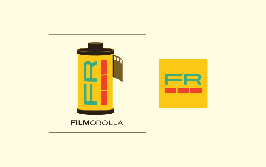
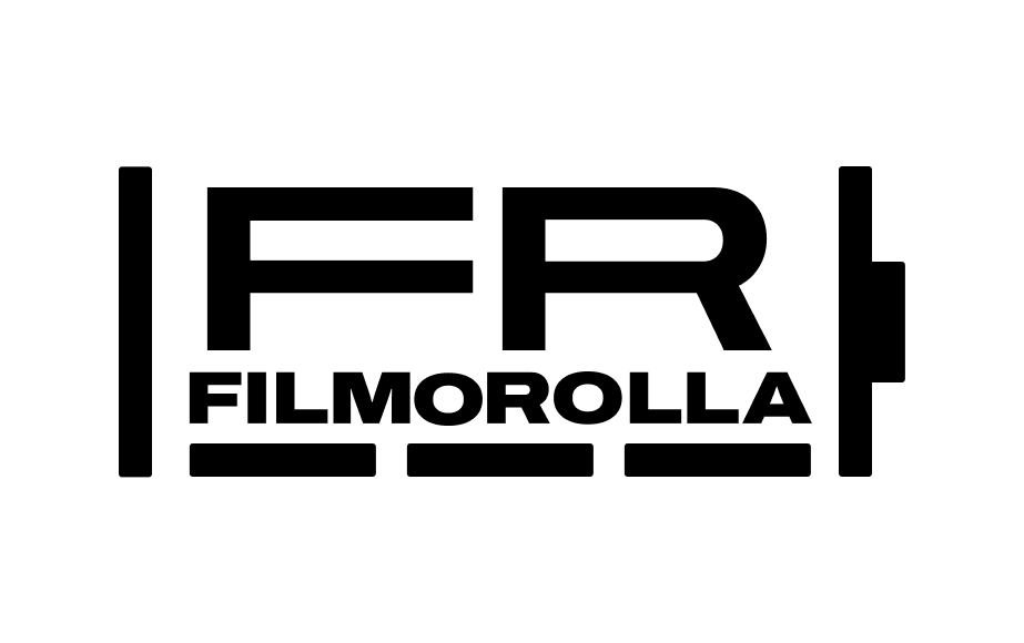
Ana and I worked through the creative direction together, the concept, the palette, the references, before she took the lead on execution. She built out a detailed film canister illustration and hand-drew the lettering to match. The result had the kind of warmth you can't manufacture in a type library: it felt made, because it was.
The film canister as a logo subject was the right call. Specific to the app experience without being illustrative in a way that doesn't scale. The hand-drawn FR gave it personality and kept it from reading like a corporate mark. In the logotype beneath the canister, Ana made a sharp typographic choice: FILM is set bold while rolla runs thin, creating a weight contrast that makes the name read in two beats and gives the whole mark more visual tension.
My feedback during development was to also create a secondary tile option using just the FR letterforms and the line detail from the canister. A simpler mark for contexts where the full canister logo was too complex to hold up, and a flexible second asset for the brand as it grows.
Illustration · Round 1
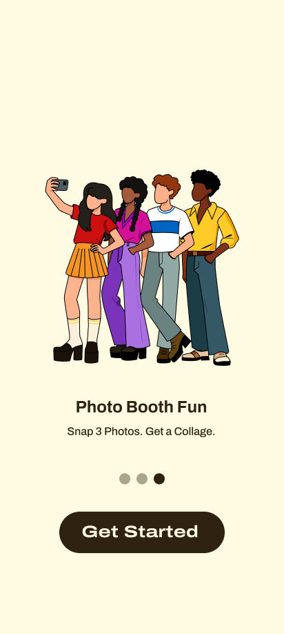
Faceless, modern, and 70s at the same time.
The app's existing instructional pages used AI-generated photos that had no visual connection to the brand identity we were building. I saw an opportunity: replace them with an illustration that felt like it belonged to the same world as the logo.
I kept the faceless character style the clients had established, it felt right for the brand, universal without being generic. The clothing style and layout were redesigned from scratch. Figures wore muted, tonal versions of the palette colors while the backgrounds carried the bright pops. Clean, flat, and modern.
The Problem
Two different looks. One brand that needed to be one thing.
When we put the logo and illustration side by side, the disconnect was immediate. Ana's logo had the character of something hand-crafted and specific. The illustration had a different energy, cleaner, more modern, less tactile. They were both good. They just weren't the same brand.
The illustration needed to meet the logo, not the other way around. Which meant going back and solving for that gap before presenting anything to the client.
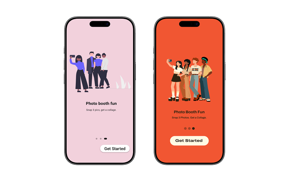
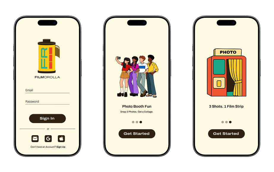
Two directions, not a problem
Rather than forcing one look to win, both had value. The modern illustration was closer to the clients' existing AI photo style. Ana's logo had warmth and craft. The solution was to develop both into complete, coherent identity directions and let the clients choose.
Illustration · Round 2
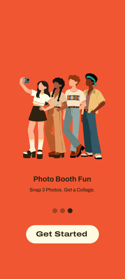
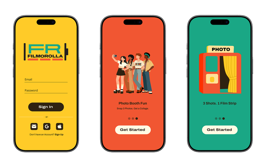
Scooby-Doo energy. Intentionally.
To meet Ana's logo, the illustration needed to go kitschy. Full 70s cartoon energy, the kind of warm graphic quality you get in Scooby-Doo. The colorful backgrounds were dropped in favor of a plain cream, and the color moved onto the characters instead: vibrant and direct. The palette colors were too muted for this register, so the illustration colors live in their own space, brighter and bolder, but working alongside the palette rather than against it.
Faceless characters stayed, but strokes and varied face shapes pushed the cartoon feel. This version felt like it lived in the same world as Ana's logo. The two things could finally sit next to each other and read as one brand.
Two Identity Directions
Nostalgic or Modern Vintage: the client got to choose.
I redesigned the illustration to match Ana's nostalgic logo, going kitschy and cartoon. But I also saw real value in the modern 70s direction, which was closer to the clients' existing visual language. So I used elements of Ana's logo to build a second logo option that worked with the modern illustration. Two complete directions, each coherent on its own terms.
Direction 01
Nostalgic
Ana's film canister logo paired with the Round 2 illustration. Hand-crafted, specific, warm. Plays into the current moment where retro detail and analog references resonate, especially with the younger audiences these apps reach.
Client choice
Direction 02
Modern Vintage
A simplified, flattened mark built from the elements of Ana's logo, cleaner geometry, bold type, same palette. A more contemporary take on the same era. Both identities were coherent; this one trades handcraft for graphic confidence.
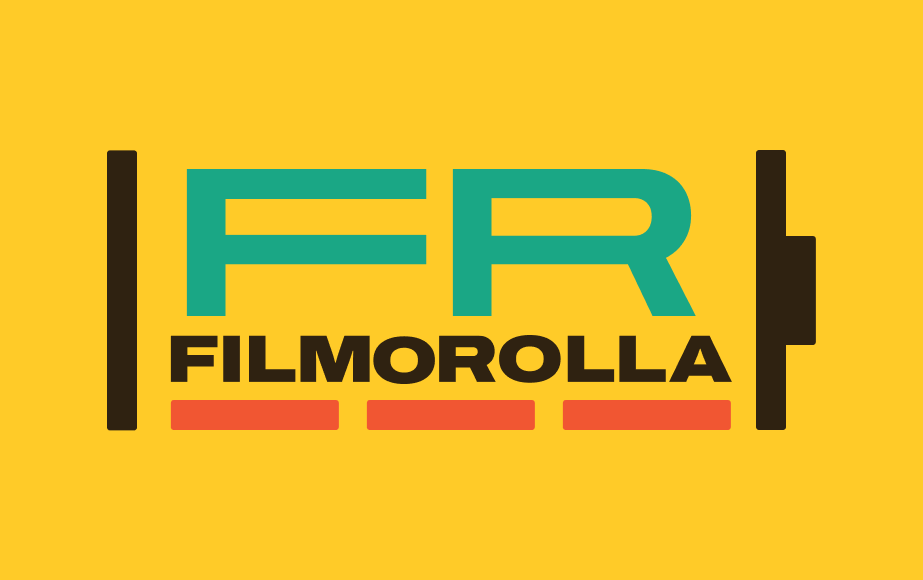
Modern Vintage Mark
The simplified direction, in detail.
To pair with my original illustration, I built a second logo using elements from Ana's design as a starting point. The FR letterforms and film canister detail were stripped back to cleaner, flatter geometry — a simplified mark that matched the energy of my illustration and gave the clients a genuinely different option to consider.
Color
The mark in full color
The Modern Vintage logo with the red underline — clean, bold, and grounded in the brand palette.
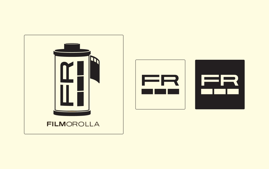
Black & White
Single-color
The same mark in black, for single-ink or monochrome applications.
Icon System
Consistency built into every tap.
The app's original icons were inconsistently sized and lacked a unified visual language. I built out a full icon set in chocolate brown, every icon drawn at the same 40px size, same stroke weight, same optical logic. Default and active states for every interactive icon.
Before
Mixed sizes, no shared weight, no consistent visual style. The inconsistency was most visible when icons appeared alongside each other in navigation or action bars. A unified set resolved this at the source.
After — The new icon systemDefault
Active
Reflection
What this project taught me.
Collaboration works best when roles are clear early. Ana owned the logo execution; I owned the illustration and icon system. That clarity kept us from stepping on each other and let both of us do better work in our lane.
Different perspectives add real value. The disconnect between our first round gave us an opportunity that we would not have had if this had been a solo project. Our collaboration allowed us to build off of each other and expand the options we gave to our client.
Presenting two identity directions gives clients real agency. The choice between Nostalgic and Modern Vintage was not about which was better, both were valid. It was about which one felt right for them. That kind of decision belongs to the client.
Icon systems are often treated as an afterthought. Building them out with the same rigor as the logo, consistent sizing, optical alignment, both states designed, is what makes a brand feel finished inside the product, not just on the surface.